After starting to work on the music video and CD digipack I can now begin to work on the Magazine Advertisement. For this task I had to do a mind map of all the music magazines that I knew (the ones in blue). I then had to go research other music magazines (in red). In blue I knew 3 music magazines this may be because I don't have an interest in reading about music, I just listen to it. They seem to be less popular in today's time so that maybe why I don't know many. Less people are buying them so the publications of them are declining rapidly so that is why there isn't a large amount of popularity towards them. Also because there so many different genre's of music and there is more or less a magazine for each genre the sales would never really do brilliant as music genre's go in and out of popularity. In doing this task I can now move on to the next task which is looking at the different magazine covers. When I researched the different ones I found there was a massive amount of them which was surprising considering how little popularity there was for them. I also found that some magazines had specific target audiences such as Kerrang had the target audience of rock lovers mainly and Q had a very broad target audience.
Research: Looking at different genres of Magazines
Q
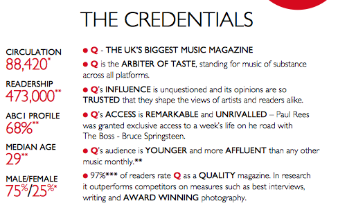
Q is a very general music magazine it covers a range of different genres. Such as Pop singer Adele to rock music from the Foo Fighters. This would mean that my artist could feature here due to the fact the magazine covers a range of genres.
Acoustic
Acoustic is the UK's only magazine dedicated to acoustic music and covers the genre of country music. This includes artists like Ed Sheeran and John Butler. My artist could feature here as it could fit in to the acoustic genre of music.
Big Cheese
The genre of music that Big Cheese is aimed at is the Rock, Metal and punk lovers. This features artists like Black Veil Brides, this won't be at all suitable for my artist as she isn't rock or metal.
Kerrang
Kerrang is aimed at the rock loves and features the rock genres. This features artists like Sleeping with Sirens and Linkin Park which like Big Cheese wouldn't suit my artist as she isn't that genre of music.
Blues and Soul
Blues and Soul feature the following music: Hip Hop, R 'n' B, House/Dance, Soul/Funk, Jazz, Reggie/World, Blues. Rainy Milo and Down to the Bone which are Hip Hip and Jazz music artists which shows my artist wouldn't be suitable for this magazine.
fRoots
The fRoots featured genre is Folk and Roots music.
The magazine that would suit my music would be: Q magazine
This would be because the magazine is aimed at those in there 20's and my target audience for Tristian Prettyman is around aged 22-30.

The median age is 29 which is around my target audience age. However it may also appeal to audiences that may be around aged 16.
Analysing an Magazine Cover
Logo: The logo is a red colour which is a standard colour its neither a male colour like blue or a female colour like pink so the magazine cover is open to both female and male audiences. Its in bold standard font so even the font isn't aimed at either gender as well. The Q is big is anyone can read it and its easy noticeable. The font is plain its got nothing such as blood dripping from it where it can be associated with a certain type of music, its a natural.
Font size: On the front cover there is a range of information on it and the important names that feature in the magazine are in bold capitals. This means the audience can easily and clearly see who is featuring in it and make the decision on whether they want to buy it based on who is in it.
Colours: The colours used are mainly white, black and red this again shows the magazine is natural in which gender it is aimed at as there are no stereotypical colours such as blue and green for men and pink and purple and female. This shows there is no preferred gender to read the magazine.
Research: Conventions of Magazine Adverts

A list of some of the conventions on a advert:
- Artists name
- Album name
- Image
- Some songs on the new album
- Date of the release of album
- Social network sites
- Reviews
- Artists website
- Record name
Research: Codes of adverts
Before I could go on to plan my advert I needed to research the codes in it so I know what to include in mine. This is important as this is something I would need to do as well to make sure the right codes are transferred to the audience when they see the advert. Like in the Chris Brown advert I could have a link between the CD and the advert such as the same clothes used or same pallet of colours. I could also now follow the codes and conventions of a typical advert or instead challenge and change them.
Below are 2 different genres of music adverts.
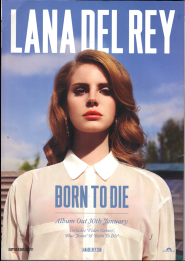
I looked at the codes of Florence + the machine's album Lungs. This genre of music was Indie Pop which is what my music could be associated with so this advert could be helpful in giving me ideas to use in mine.
Planning: Ideas for my magazine advert
After looking at codes and conventions for a magazine advert I can now use that knowledge to create my own advert either using those conventions or codes or challenge them.
Below are some ideas I have for my magazine advert main image.
Idea 1: This is one idea, it shows the relaxed feel and would appeal to my target audience as its a natural image and fits in with the theme of my music video which is outdoor. With no having the face in it I believe it looks better with out. It shows there maybe mystery about her and you wonder where she is looking she looks like a day dreamer which is what she partly is a relaxed day dreamer. This picture would give me space where the lake is to add the text so it doesn't cover the main image. However because it is a outdoor location its harder to control what the lighting is, such as if it dark or raining there isn't anything I can do only to go back another time to the picture, this is the same with the picture below. I don't have the money or technology to bring the best lighting in to get the right lighting conditions, so I have to make do with the natural light.
Idea 2: This would highlight the relationship which is a main theme in the album. Again there is the outdoor feel that is present in most of her songs. The text could go under the feet or by the side of the male, there is plenty of space for the text to go and look affective.
In the picture id have the girl sitting on the centre of the bed.
Idea 3: This would be a good picture due to the fact the its a light romantic feel to it which is present in many of Prettyman's songs. Also the artist would be sitting centre stage so the audience could clearly see who the singer was and know what she looks like. It has a very girly feel to it which is really who the album is aimed at. It would look very vintage which will again show the romantic feel to it, also it would further my knowledge in lighting to use this as I want picture to resemble this very closely which would mean I need to use the lighting in a certain way to re create this sort of picture. The good thing is that its an indoor location so I have full control over the lighting, where as in a outdoor location it would be harder to control what the lighting looks. However I would have to consider where the font would go so it doesn't cover the picture and ruin it.
Research: Audience feedback
After asking 20 people there opinion on which advert they liked it was idea 3 that they liked best. However idea 1 was very close behind. This means that when I highlighted the above point about the font not really fitting anywhere, if the font doesn't work anywhere and the picture doesn't look right I could use idea 1. The audience would agree that idea 1 is good as well so I could use that as a back up.
Planning: Where next?
Like with the digipack I can now practice using Photoshop so I can decide on what and where the font I will be and go. After doing that I can then go out to take the pictures for the advert. After looking at my two top choices idea 1 and 3 I decided that it would be easier to go with idea 3 due to the fact it would overall look better. There is space next to the couple so I could add in text next to them also I can edit the grass to be dark or lighter however I want. With idea 3 it would be harder to get my desired lighting effect with the fact that there is no space for the text to go without it covering some of the main image and this would take away my desired effect. Also the album is very outdoorsy so it makes sense to have the magazine cover set outside as this matches the outside theme of my CD pack. Also because my genre is Indie Pop I chose the outdoor feel to match the genre. Therefore I have chose idea 2.
Planning: How to change the background to black and white
I decided to practice changing the background to black and white which I am maybe using in my advert.
Firstly I needed to import the picture in to Photoshop.
I then needed to click this button the the left hand side.
After clicking that button I could then click in a sort of circle till a certain area is highlighted.
Then I need to go to image and the Adjustments and then to Black and White. However there was other options I could have tried out.
After clicking Black and White it then sent my highlighted area in to Black and White.
This is what the black and white looks like.
After doing that I could then carry on until the whole background is more or less in black and white.
Planning: Using Photoshop to create ideas
After deciding my picture to use and having already decided on the font to use (the same as on the CD digipack) I decided to then to use the same font on the magazine advert. I then decided to come up with some ideas for it.
Idea 1: This is how id like my advert to look however I didn't like the pink colour as it is really hard to see. Me next idea I will keep the style the same but change the colour to see if other colours work better.
Idea 2: The red looks much better due to the fact I can see it clearer and it fits better with the Indie Pop genre.
Planning: Using Photoshop to create ideas
If I decide not to use the black and white effect I decided to try out different ideas with the font colour of the colour in the background.
Idea 2: The black works better and it also matches the CD colour font. So this would show the link between the 2 projects.
Planning: Where next?
Like with the CD digipack I can now go on to take the pictures for my advert and then go on to try out whether the image looks better in black and white or colour this will be decided in the Production phase.
Pictures for my advert
I went out and got someone to take a range of pictures to use for my media advert. I can now go through them a decide which one looks the best and fits best for my advert.
Editing the Advert
Firstly I edited the picture on 'Pic Monkey' to ensure the picture had the same filter on the pictures as the CD did. In doing that it would show the link between the 2 tasks.
I then took a screen shot of the front of the CD cover to put on the side on the advert so the audience know what the CD looks like if they want to buy it.
I did that by opening it.
I then placed it at the side of the advert in the corner so the audience could see it.
I then brought in the 'Available on ITunes' picture so the audience know where the CD is available as ITunes is a popular place to download music off.
After adding in a quote from Q magazine and putting it at the bottom in the grassy part I realised that a pale blue colour wouldn't work as it was hard to be seen. I then decided to use the colour white.
I played around with the positing to see where the text looked best.
After doing that I brought in the twitter sign and her twitter name so the audience has a easy way of finding out new information such as release of new songs, albums and touring dates.
This is the product.
After looking at the colour of the font I again decided to change it I changed the main information to a pastel pink which is the same more or less feel as the pastel blue which shows again the link of the 2 tasks. However I had to change the other information to black as I struggled to find a colour which could be seen and fitted with the feel of the music. I am still deciding over the font and where it is and would be likely to change it.
Change to my ideas
I decided to change the picture mainly for the fact I didn't like the fence being in the background as it didn't make the picture look natural like I wanted. I also I didn't like my fringe covering my face as I believed it ruined the shot so for those reasons I changed the picture.
To match my CD cover I decided to use the same font and colour, in doing this I had to rearrange where my font went.
I then put the 'Now on iTunes' picture as I thought it was less important so I put it down there. I then put the CD cover picture in the top corner so it is easy to see.
Changing text
"Say Anything" Tristan Prettyman Completed Music Magazine Advertisement for Q Magazine


